


Jim Schindler is the man behind one of the world’s most recognised logos: he played a decisive role in the development of McDonald’s famous golden arches.
The American burger chain’s famous golden arches actually started out as architecture; they didn’t make it to their current status of logo until 1962.
Up until then, McDonald’s logo was a jaunty little hand-drawn character called Speedee who had a hamburger for a head and wore a chef’s hat.
Instead, the golden arches we know today were strictly limited to the roofline.
Designing a New Kind of Restaurant
When the McDonald brothers were looking for an innovative design for their new fast-food restaurant in 1952, they approached several architects – asking them all to incorporate the yellow arches into their design.
This didn’t go down to well with several of the architects they interviewed, but eventually they met an architect called Stanely Clark Meston, who presented the brothers with a gleaming new design for their drive-thru restaurant.
With red and white tiles, and a distinctive roofline that slanted sharply downwards to the rear of the building, Meston streamlined the arches into tapered parabolas that would thrust into the sky on either side of the glass-fronted façade.
Saying ‘Goodbye’ to Speedee The McDonalds restaurant buildings were so recognisable that, by the time the company started looking for a new, sleeker logo in 1962 in order to update its image, it made sense to incorporate the building design into the logo.
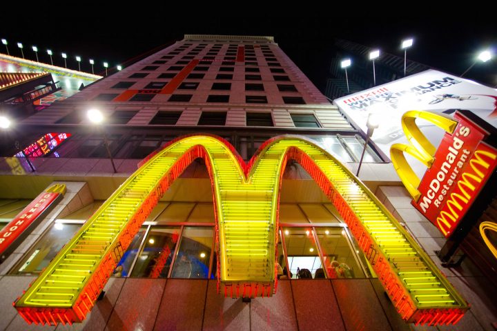
The Golden “M”
The original designer the McDonald’s team approached, George Dexter, a sign-maker, sketched out a stylised “V” that didn’t match the McDonald’s expectations.
Enter Jim Schindler, McDonald’s Head of Engineering and Design, who sketched out a logo that incorporated the distinctive slanting roof of the restaurants cutting across the golden arches of the roofline, now represented as a golden “M”.
It was adopted and was the first iteration of the logo we know today.
